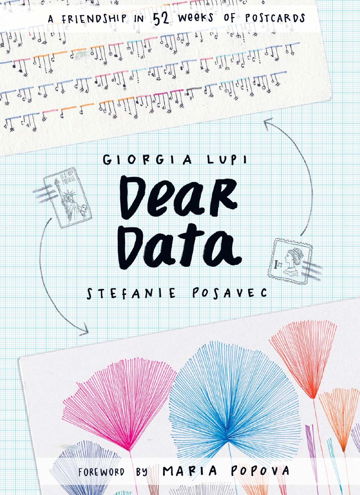
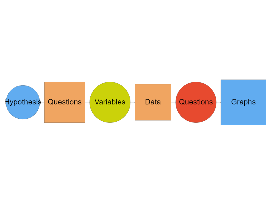
What makes Human Experience?
How would we begin to describe this experience?
- Where / When?
- Who?
- How?
- How Big? How small? How frequent? How sudden?
- And....How Surprising ! How Shocking! How sad...How Wonderful !!!
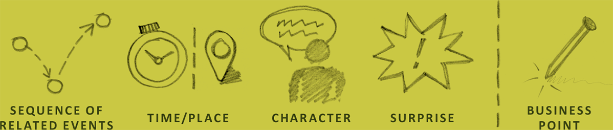
So: Our Questions, and our Surprise lead us to creating Human Experiences.
Is This a Surprise?
Needs to be celebrated. Spotted in a men's washroom at @BLRAirport - a diaper change station.
— Sukhada (@appadappajappa) June 27, 2022
Childcare is not just a woman's responsibility.
👏🏻✨ pic.twitter.com/Za4CG9jZfR

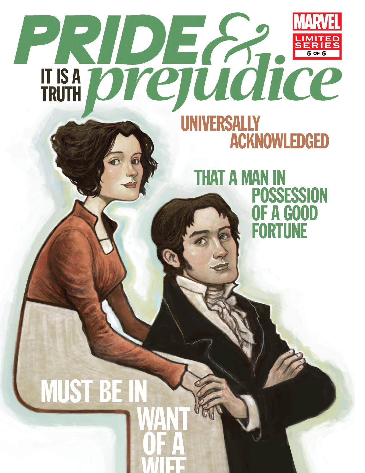
The Element of Surprise?
Jane Austen knew a lot about human information processing as these snippets from Pride and Prejudice (published in 1813 -- over 200 years ago) show:
- She was a woman of mean understanding, little information, and uncertain temper.
- Catherine and Lydia had information for them of a different sort.
- When this information was given, and they had all taken their seats, Mr. Collins was at leisure to look around him and admire,...
- You could not have met with a person more capable of giving you certain information on that head than myself, for I have been connected with his family in a particular manner from my infancy.
- This information made Elizabeth smile, as she thought of poor Miss Bingley.
- This information, however, startled Mrs. Bennet ...
https://www.cs.bham.ac.uk/research/projects/cogaff/misc/austen-info.html
Human Experience is....Data??
Experiments and Hypotheses
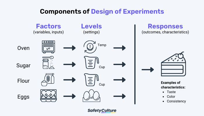
A Kitchen Experiment
- Inputs are: Ingredients, Recipes, Processes
- Outputs are: Taste, Texture, Colour, Quantity!!
A Famous Lady and her Famous Experiment

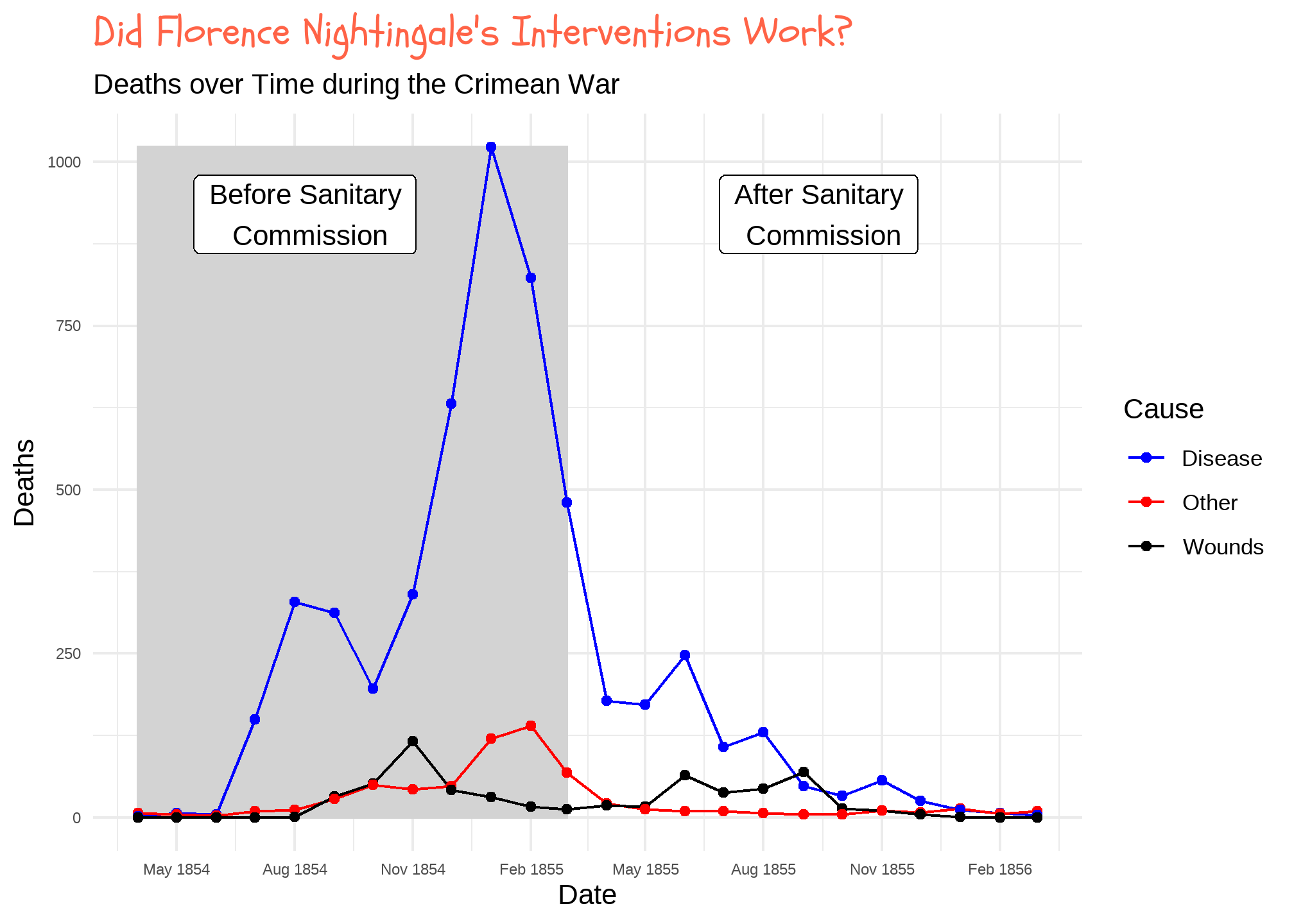
In 1853, Turkey declared war on Russia. After the Russian Navy destroyed a Turkish squadron in the Black Sea, Great Britain and France joined with Turkey. In September of the following year, the British landed on the Crimean Peninsula and set out, with the French and Turks, to take the Russian naval base at Sevastopol.
What followed was a tragicomedy of errors -- failure of supply, failed communications, international rivalries. Conditions in the armies were terrible, and disease ate through their ranks. They finally did take Sevastopol a year later, after a ghastly assault. It was ugly business all around. Well over half a million soldiers lost their lives during the Crimean War.
How Does Data look Like, then?
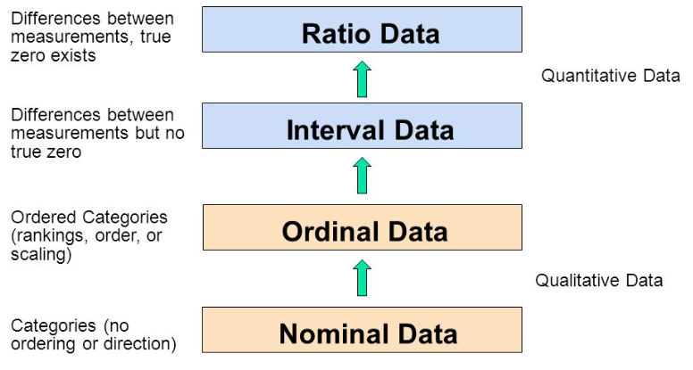
Types of Variables:
Using Interrogative Pronouns
- Nominal: What? Who? Where? (Factors, Dimensions)
- Ordinal: Which Types? What Sizes? How Big? (Factors, Dimensions)
- Interval: How Often? (Numbers, Facts)
- Ratio: How many? How much? How heavy? (Numbers, Facts)
Types of Variables in Nightingale Data
Using Interrogative Pronouns:
- Nominal: None
- Ordinal: (Factors, Dimensions)
- HOW?
War, Disease, Other
- HOW?
- Interval: (Numbers, Facts)
- WHEN?
Year, Month
- WHEN?
- Ratio: (Numbers, Facts)
- HOW MANY?
Rate of Deaths(War, Disease, Other)
- HOW MANY?
| Month | Year | Disease.rate | Wounds.rate | Other.rate |
|---|---|---|---|---|
| Apr | 1854 | 1.4 | 0 | 7.0 |
| May | 1854 | 6.2 | 0 | 4.6 |
| Jun | 1854 | 4.7 | 0 | 2.5 |
Nightingale's data table had dimensions coded into column names. This is not considered tidy in the modern age
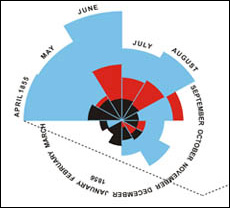
Nightingale's Rose
Nightingale created a remarkable and original graphical display to show us just what hadd really gone on in the War. It was a Polar-Area Diagram that showed how people had died during the period from July, 1854, through the end of the following year.
Nightingale's graph is like a pie chart, cut into twelve equal angles. These slices advance in a clockwise direction, one each month. The radius shows how many deaths occurred in that month. We see little short slices in April, May and June of 1854. After the troops land in the Crimea, the slices begin reaching far outward in the radial direction.
There's more: Each slice has three sections, one for deaths from wounds in battle, one for "other causes", and one for disease.
Once you see Nightingale's graph, the terrible picture is clear. The Russians were a minor enemy. The real enemies were cholera, typhus, and dysentery. Once the military looked at that eloquent graph, the modern army hospital system was inevitable.
So, Did the Sanitation Commission succeed?
Nightingale's famous Coxcomb or Rose Plot
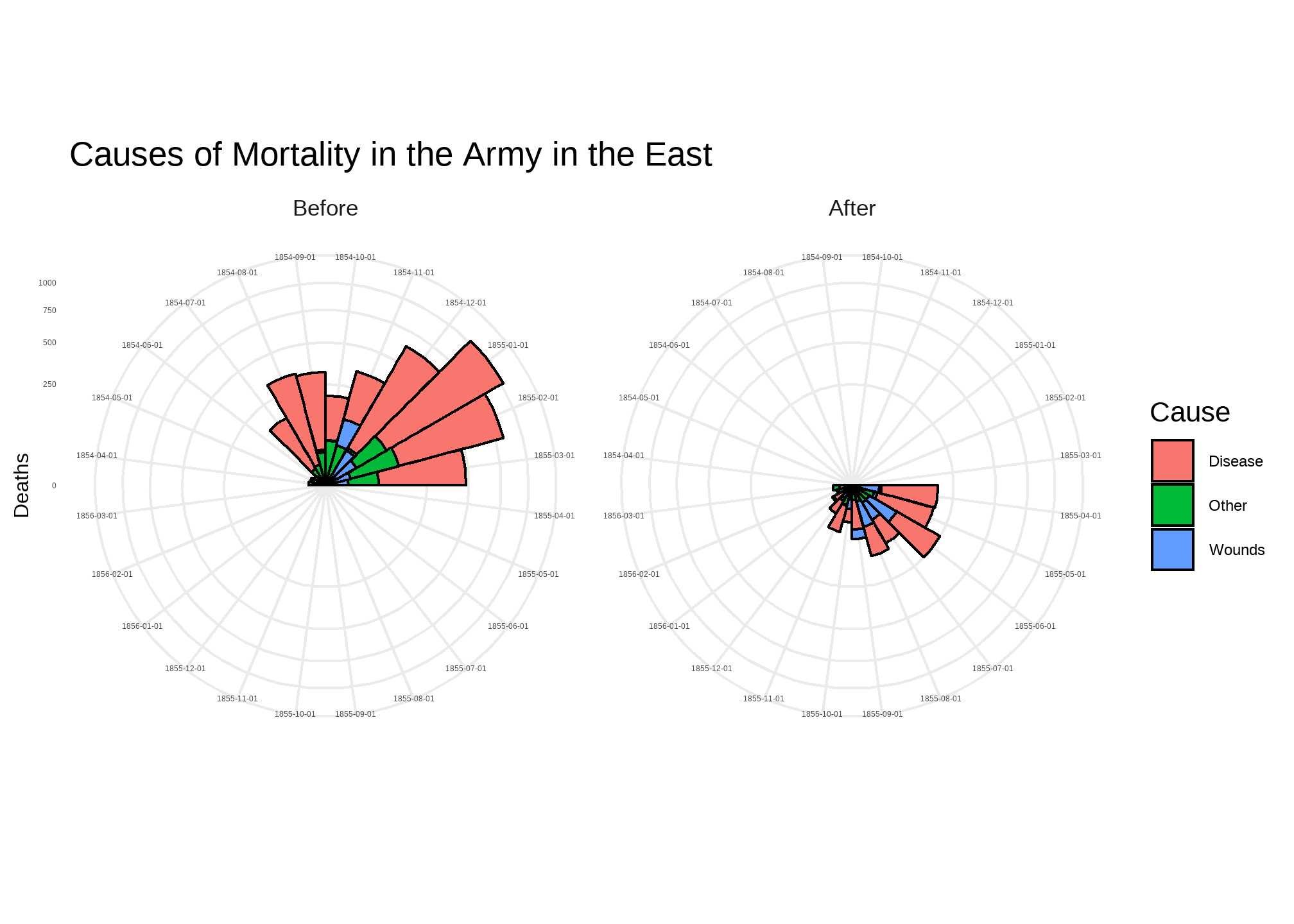
"Engines of Our Ingenuity", https://www.uh.edu/engines/epi1712.htm
From Data -> Geometry
- How did we arrive at shapes, colours, lines, points...from data?
- All Statistical Graphs do a Kalidasa:
- Transform a variable with a
stat(count,bin,sort) - they use metaphors to map data variables and computed stats to geometrical aspects aka aesthetics
- Transform a variable with a
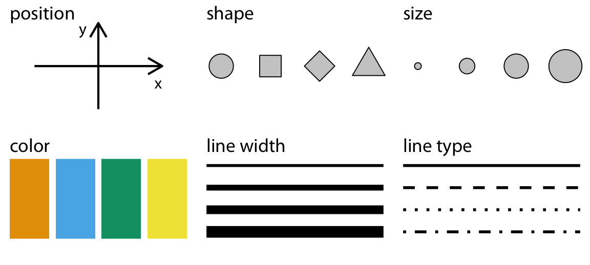
- Commonly used aesthetics in data visualization: position, shape, size, color, line width, line type.
- Some of these aesthetics can represent both continuous and discrete data (position, size, line width, color)
- While others can usually only represent discrete data (shape, line type).
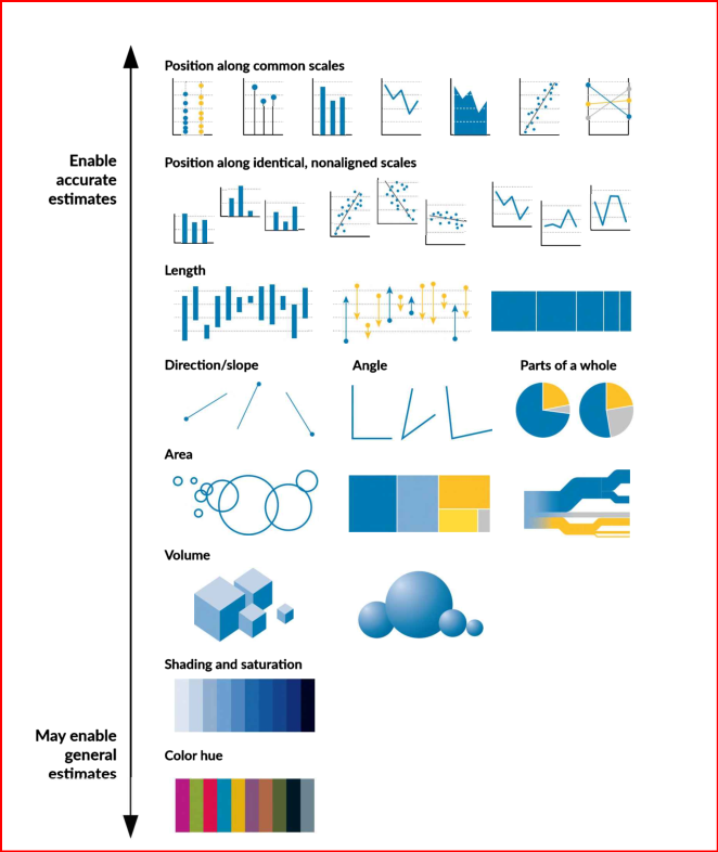
Each of the geometries works differently
The Need for Answers: Questions to Visuals
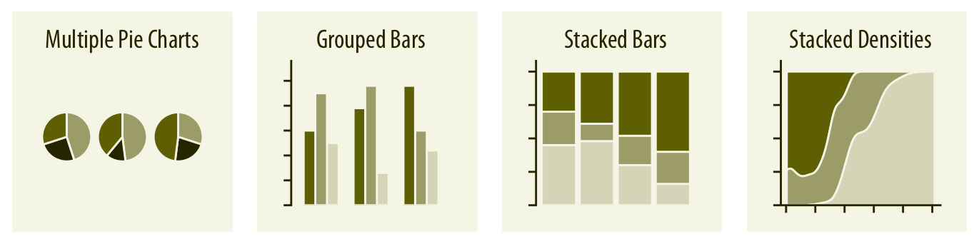
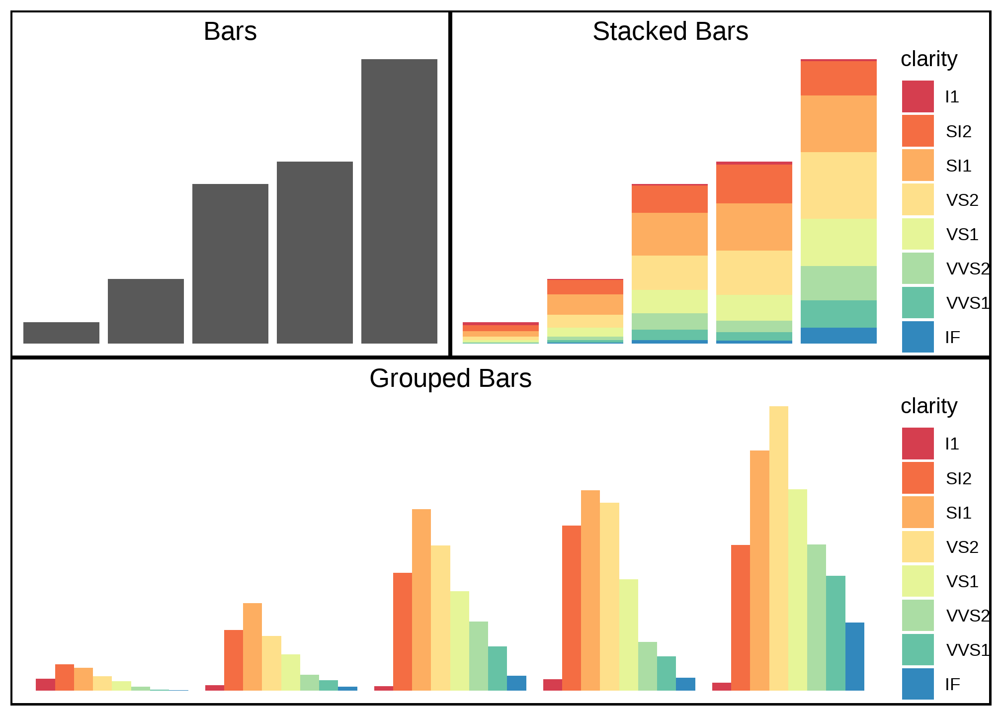
Variables and Graphs: Qualitative Variables
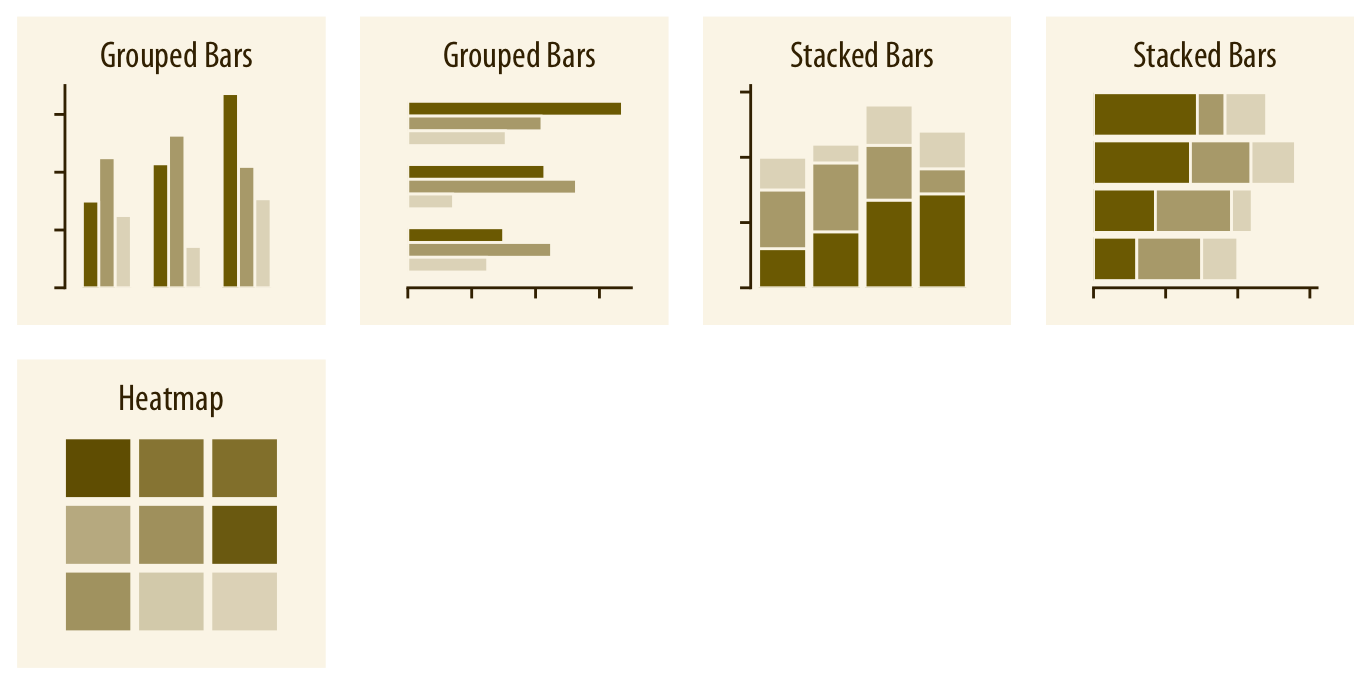
Amounts and Counts
- Variable: Ordinal / Nominal
- Stat:
count - Geometry: height and colour
- Questions:
- How many of each type of #Var1?
- How many of each type of #Var2 broken up by #Var2?
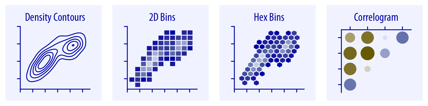
Variables and Graphs : Quantitative Variables
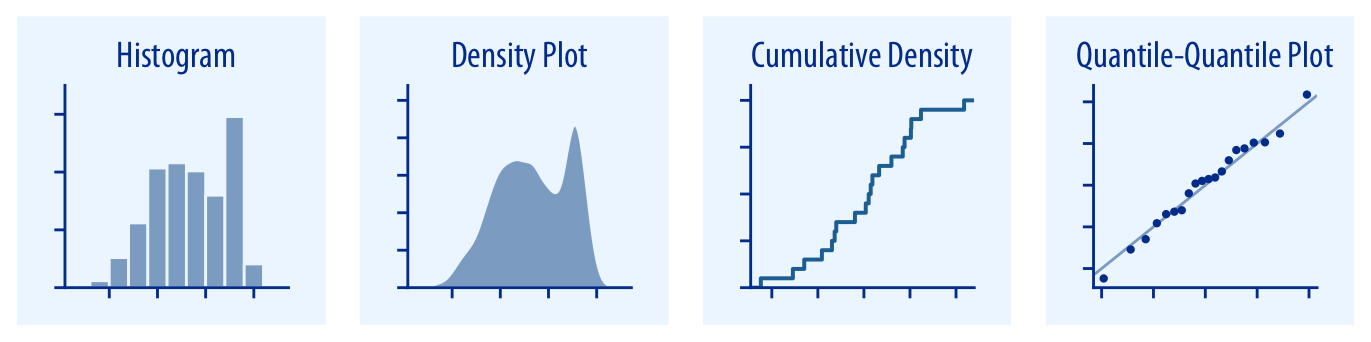
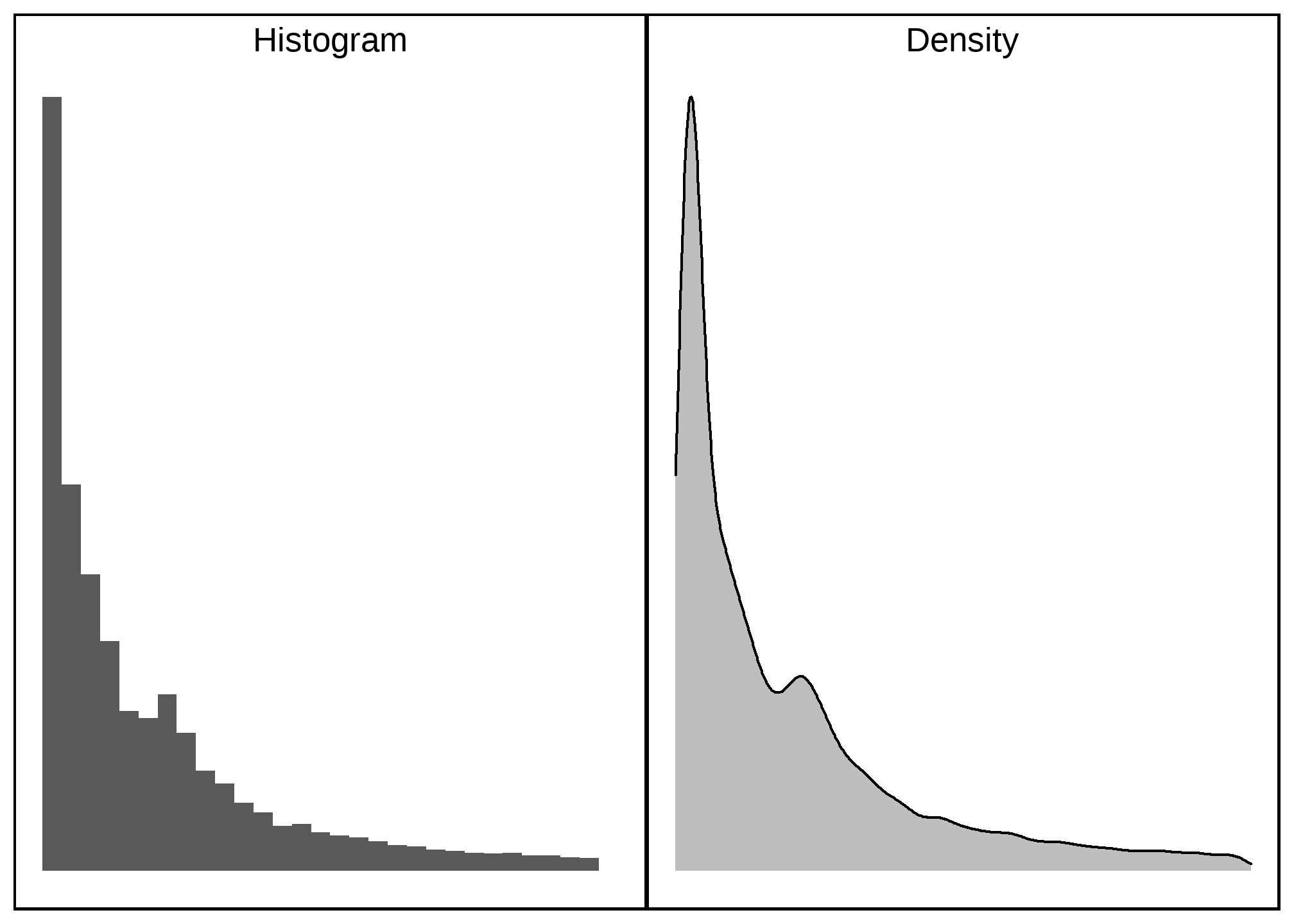
Distributions
- Variable: Interval / Ratio
- Stat:
binandcount - Geometry: x = bins, y = count, and colour
- Questions: Range and frequency of Interval/Ratio variable
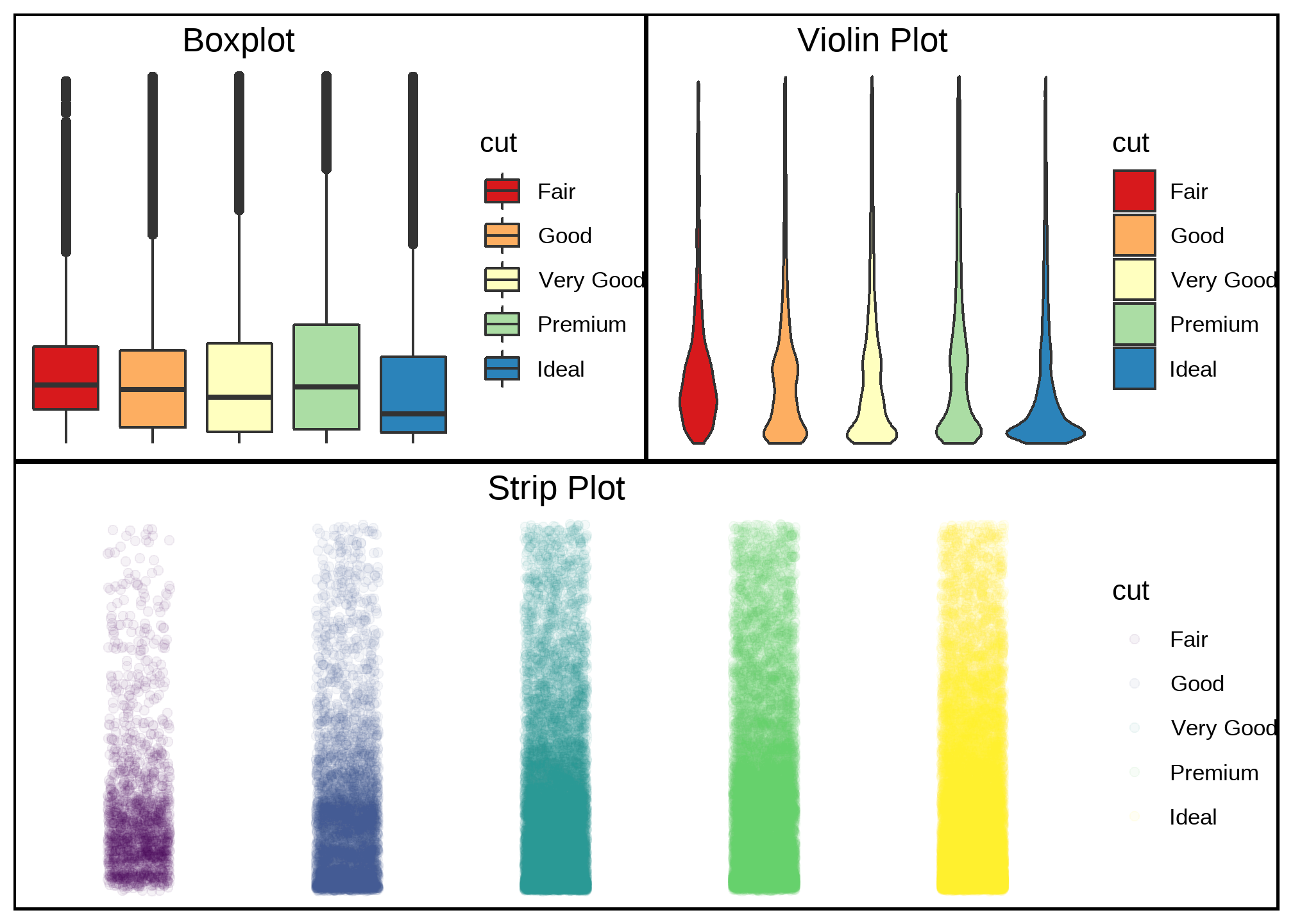
Variables and Graphs : Quantitative Variable
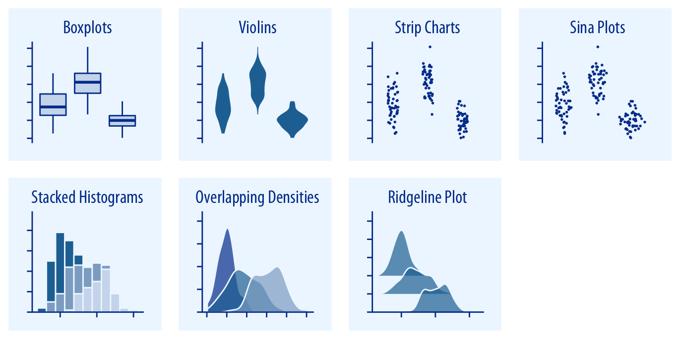
Distributions (Many of them at once)
- Variable: Interval/Ratio + Nominal/Ordinal
- Stat:
sort(boxplot),bin(violin) - Geometry: x = Nom/Ord, y = Int/Ratio, and colour = Nom/ord
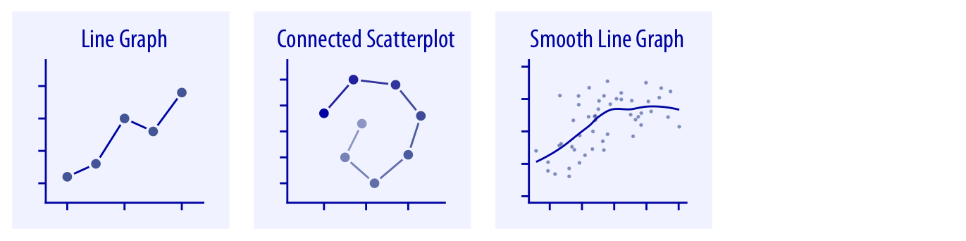
Variables and Graphs : Quantitative Variables
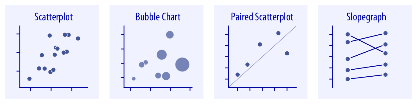
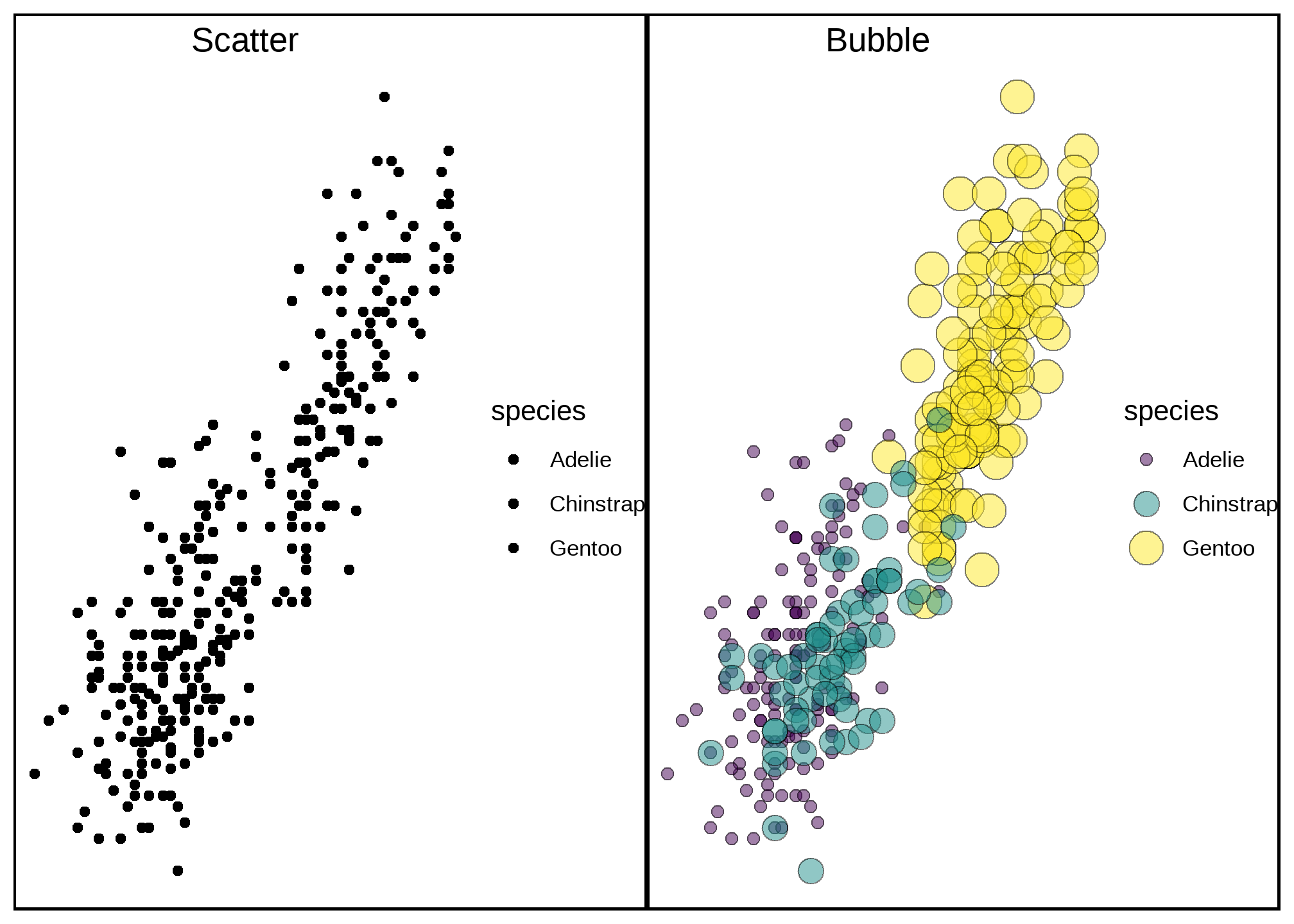
X-Y Relationships
- Variable: Interval/Ratio + Nominal/Ordinal
- Stat: none
- Geometry: x = Int/Ratio, y = Int/Ratio, and colour = Nom/ord